CAN YOU SEE BEYOND WHAT IS RIGHT IN FRONT OF YOU?? Photography Tip #23
And now, please continue to read this post for an unedited glimpse into the mind of Steve! I know…it’s acary, isn’t it?
I have developed a strong fascination for the flower and all the creativity that goes along with the process of presenting a beautiful flora print. You may remember this image from a recent post:
I actually have this framed in a black frame with a black single mat combined with a secondary black floating mat. It actually looks three-dimensional in that presentation!
I’ve learned to see beyond what I’m shooting when it comes to flowers. In order to present something unique and beautiful in a way that becomes the signature to your style, you must be able to see beyond what is in front of you.
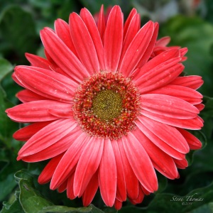
Allow me to demonstrate. Here’s a recent photo I captured while visiting my local nursery one afternoon. You wouldn’t recognize it, because I’ve never presented it this way. In its original state, I thought it was somewhat common. I mean there were hundreds of blooms exactly like this one. So, what would make this one special? Well, nothing really – especially in its original presentation.
If you carefully examine the flower, you’ll easily notice the flaws in the pedals. And, you can also see the harshness of the lighting that day.
Now this is where someone may be saying, “The flaws in the pedals contribute to the uniqueness of this bloom.” Not really, as every bloom contained similar flaws. I guess I look at this situation the same way I look at portrait photography. I haven’t met too many people who prefer all their facial blemishes to be retained. No, the first question they ask me is, “Can you remove this or that? Or, can you make me look better?” So in the same way, I think this bloom would want it’s blemishes to be softened.
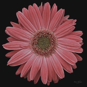
My first edit was to clone out the blemishes to present a more uniform pedal. Then, I knocked down the highlights to soften the image.
I found myself unhappy with the background. I know when I capture a flower image from directly over the bloom, my background is going to be problematic. Even if it blurs a little, it still seems distracting to me. So, I change it. You can do that very easily by either carrying a black backdrop to place behind the flower, or paint the background black in your editing process. I have chosen to paint the background black using the PS Elements 8 software.
Now, I could stop here. But, that’s just not what I was seeing for this flower. I was visualizing something much softer! In order to create that effect, I simply began to reduce the color saturation. Now this is very different because we often find ourselves boosting the color saturation. But, not here. Not this time. No, I was seeing something else.
Better, but still not quite was I was visualizing. So, I continued to reduce the color saturation.
PERFECT!!! This was exactly what I had seen in my mind when I captured the original image. This is very important! You must be able to visualize before you can create!
FOOTNOTE: For the purists who may still be reading this post, I did leave the folded pedal flaw located in the upper right section of the bloom. I thought that added character!
From this point I can begin to create varying images to appeal to varying tastes. In the image below, I’ve added a posterization layer. In this particular application, this looks alright, but the original looks better (to me). But, it’s important as a photographer to recognize that people have differing tastes. What appeals to one, may not appeal to another.
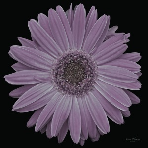
Still consumed with creativity, I further adjusted the hue/tint to present a completely different color palette. It’s very nice. It’s soft much like the first edit, only in a different color.
Again, I added a posterization layer because some people really like this effect. In fact, the very first image has this effect applied to it and I really like it in that application. It’s all about personal taste. But again, realize early that those personal tastes differ greatly.
In this presentation I used another hue/tint adjustment to create yet another image.
And finally, a sepia layer for a completely different appeal.
So as you can see from one single image, if you can see beyond what is right in front of you, the possibilities are limitless!!

![a-rose-in-black-2a1[1]](https://photographyfree4all.files.wordpress.com/2011/06/a-rose-in-black-2a11.jpg?w=300&h=300)


Great Post! I have to say the image before you adjusted the saturation is my favorite. I think the brights against the black background give a dimension the later softer photos don’t. However, I think even the softer images are quality. If I were to buy one though, it would be the bright on black.
I am starting to undergo the same scrutiny of color as you are, so this post was very helpful for me to read. Thanks!
LikeLike
Hi Nels! It’s great to see you back in the comment column. You have so much to contribute!! 🙂 I’ll admit, I really liked the bold version too – especially when I applied the posterization layer! But what you are saying here goes to support exactly what I’m learning, Nels!! Everyone is different! That’s what makes photography so great. You like the bold print!! I’m sure others will too. We’ll see. Thanks so much for jumping in!! Come on back, soon and let’s do this again. 🙂
LikeLike
Awesome! I love them all. I can see them hung as a set on the wall! Oh, and thanks for giving my clock image a title!
LikeLike
Interesting and exciting glimpses from a world I have not yet moved me into!!! 😉
LikeLike
You know when I saw your photo, “Times Square” just popped into my mind! 🙂
Thanks for stopping by! I hope you’ll continue to be a part of this little community.
🙂
LikeLike
Jump in, Truels! The water’s fine! 🙂
Good to see you again!
🙂
LikeLike
A black backdrop! I wondered how photographers got those dark backgrounds. Thought it was just lighting. Thanks for the tip!
I like the soft pink image the best.
LikeLike
Sometimes it can be the lighting, Ms Pearl. But, most of the time it’s easier to use a backdrop – or like I’ve done here, Just paint the background black. I love your comments! Keep ’em coming…
🙂
LikeLike